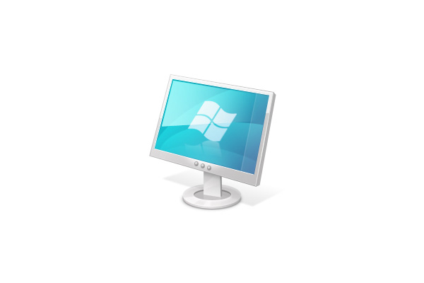
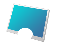
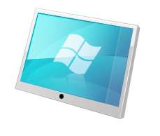
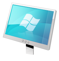
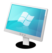
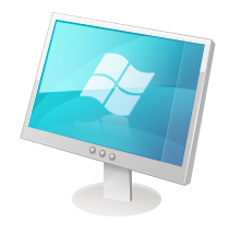
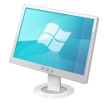
Preview
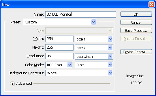
Step 1: Set Up the Canvas
Open up Photoshop. Create a new document (Ctrl/Cmd + N or File > New). We will use a square 256×256px canvas.
Step 2: Draw the Panel’s Base Shape
Create a new layer (Ctrl/Cmd + Shift + N or Layer > New Layer). Name this layer as "panel-base" so that we are keeping our work organized.
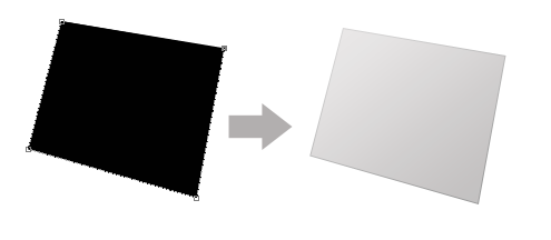
Draw an angled rectangular shape using the Pen Tool (P). You may also use the Rectangular Marquee Tool (M) and then use Free Transform (Ctrl/Cmd + T) to alter its perspective and angle — this is up to you.
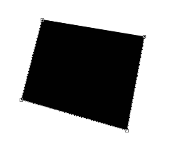
As you can see above (if you used the Pen Tool), by default, Photoshop will draw a gray border around your shape so that you can see the edges. Although it doesn’t affect the shape and is merely a visual aid, it can be distracting and can make it difficult to see exactly what your shape looks like. You can turn this border on and off by pressing Ctrl/Cmd + H (shortcut for View > Extras).

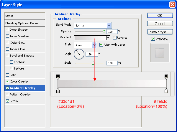
Step 3: Give the Base Shape a Layer Style
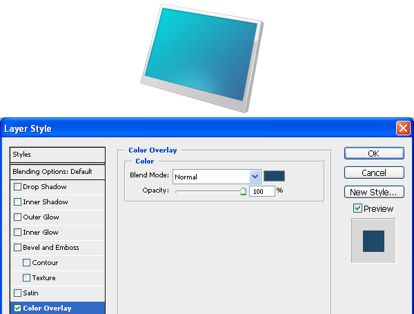
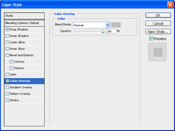
Next, double-click on this layer to bring up the Layer Style dialog window. We shall give this shape three layer effects: a Gradient Overlay, a Color Overlay, and a Stroke.
Gradient Overlay
Have the gradient go from gray (#d3d1d1) to off-white (#fefcfc).
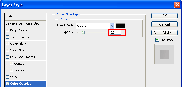
Color Overlay
This low-opacity color overlay will make our shape a little darker. Use black (#000000) for the color and lower the Opacity to 8%.
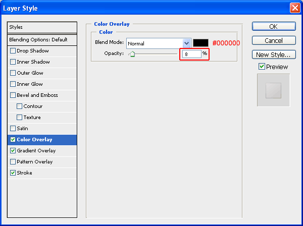
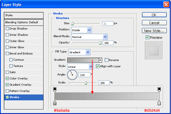
Stroke
Give the object a stroke that has a color gradient going from gray (#9a9a9a) to light gray (#d5d4d4).
The layer style will add the desired effects to the flat shape as shown below.
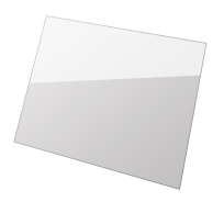
Step 4: Add a Glass Reflection to the Panel
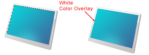
Create a new layer (name it as "panel-gloss"). Create a white shape in this layer like the one shown below. You can Use the Pen Tool (P) for this.
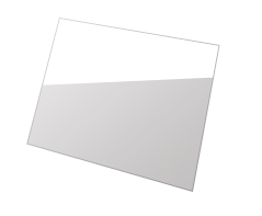
Set the Opacity of the layer to 67%.
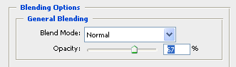
This will let a bit of the gradient background show through.
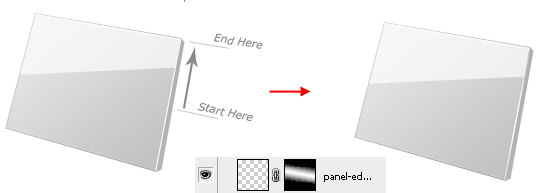
Step 5: Draw Lines at the Top and Bottom of the Panel
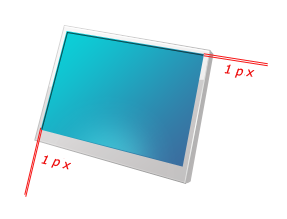
Choose the Line Tool (U) from the Tools Panel. Create a 1px white line at the top edge of the panel. You can use Ctrl/Cmd + H to hide the gray border that Photoshop puts around our shapes so you can see the result better. Rename this shape layer as "top-edge-shine".
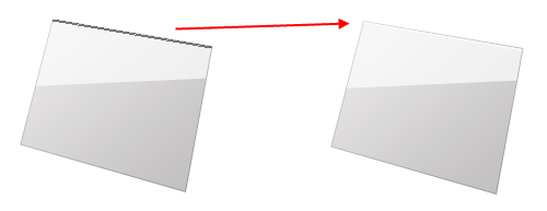
Similarly, draw a 1px white line at the bottom of the panel (you can name this shape layer as "bottom-edge-shine"). Set the Opacity of the layer to 20%. The effect is subtle, but plays a major role in setting up visual appeal.

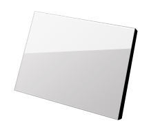
Step 6: Give the Panel Its Depth
Make a new layer (which can be named "panel-thickness"). On this new layer, create a black shape on the right side of the panel.
Step 7: Style the Left Side of the Panel
Give the left side of the panel ("panel-thickness") a Color Overlay and a Gradient Overlay.
Gradient Overlay
The linear gradient should go from gray (#d3d3d3) to light gray (#ebe8e8). Make sure to set your Angle correctly.

Color Overlay
Set the Color of the overlay to black (#000000) and reduce the Opacity to 20%.

Step 8: Add Details to the Left Side of the Panel
Now create a new layer (name it "shine-basic"), and under this layer, create a white line along the left edge of the left side of the panel. Reduce the Opacity to 40% after creating the line.

Duplicate this layer by pressing Ctrl/Cmd + J and set the Opacity of the duplicated layer to 100%. Add a layer mask to this duplicated layer by clicking on the Add layer mask icon at the bottom of the Layers Panel.
Choose the Gradient Tool (G). Make sure that your gradient is going from white to black and that the Reflected Gradient option is enabled (do this in the Options Bar of the Gradient Tool).

Drag the Gradient Tool onto the layer mask, starting from about the middle and going towards the top edge of the panel.
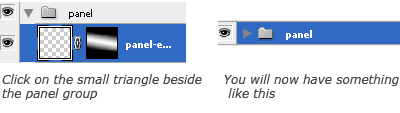
Step 9: Organize the "panel" Layer Group
Create a new group (name this layer group as "panel") and drag every layer into it except the Background layer. Click on the triangle on the left of the layer group to collapse it.
Step 10: Create the Screen Base Shape
Create a new layer (you can name it "screen-main") just above the newly made "panel" layer group. Draw a rectangular shape on top of the panel using either the Pen Tool or the Rectangle Tool (U), using Free Transform to adjust the perspective.
Step 11: Add a Gradient Overlay to the Screen Base Shape
Give the shape layer a Gradient Overlay going from a light blue (#3b6c9e) to a darker blue (#0ad2d9).


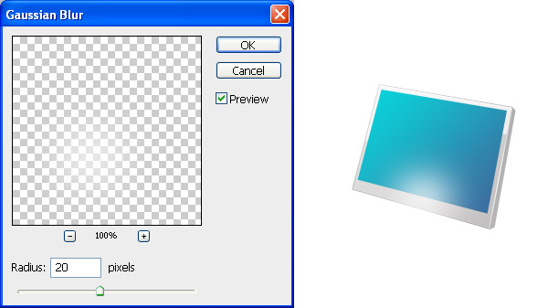
Step 12: Create a Bottom Screen Glow
Now create a new layer ("bottom-screen-glow") and make an elliptical white shape at the bottom of the panel with Ellipse Tool (U).
Apply Filter > Blur > Gaussian Blur to soften the elliptical white shape.
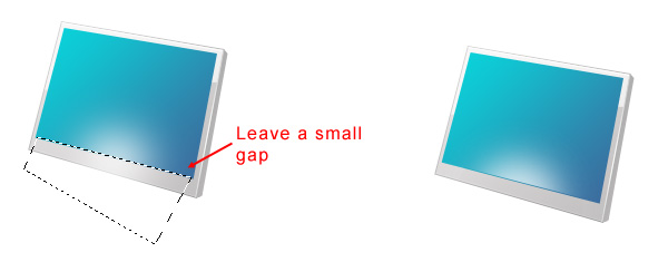
We will need to delete the part of the glow that spills out of the screen. Select the Polygonal Lasso Tool and then make a selection at the bottom edge of the screen, but leave out about a pixel of the screen so that it will create a nice realistic effect.
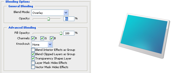
Switch the glow layer’s Blend Mode to Overlay and reduce its Opacity to about 56%.
Step 13: Create the Inner Shadow
Create a new layer (name it "inside-edge-shadow") and trace on the top and left edge of the screen using the Line Tool (U).
Give the shape a dark blue color overlay.
Duplicate the "inside-edge-shadow" layer (name the duplicate layer as "inside-edge-shine"). Use the Move Tool (V) to move this layer about 1px above the inner shadow. Give it a 1px color overlay (#ffffff) to create a nice inset effect for the inner shadow.
Step 14: Create the Screen Texture
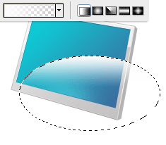
Create a new layer. Make a selection using the Elliptical Marquee Tool towards the lower half of the monitor.

Use the Gradient Tool (G) to apply a white-to-transparent linear gradient starting from top to middle of the selection.
Duplicate the layer (Ctrl/Cmd + J). Choose Edit > Free Transform (Ctrl/Cmd + T) and rotate the duplicated layer by roughly -30o.
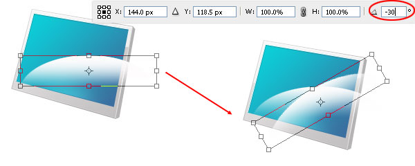
Again, duplicate the layer that we just rotated. Use Free Transform again to rotate the duplicated layer by about 45o. Also, Use Move Tool (V) to arrange these 3 layers to make them look like a fan of feathers.
Merge the latest 3 layers by selecting them in the Layers Panel, right-clicking on one of them, and then choosing Merge Layers. Name this merged layer as "waves" for organization.
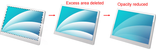
Now click on the "screen-main" layer in the Layers Panel to select it. Use the Magic Wand Tool (W) to select around the screen’s base shape. Invert the selection (Select > Inverse). Press your Down Arrow key once to move the selection a bit, switch back to the "waves" layer, and hit the Delete key to remove the excess areas. Then just reduce the "waves" layer’s Opacity to about 15-20%, so that it’s not so prominent.
Right-click on the "waves" layer and then choose Convert to Smart Object. To finish off this design flourish, switch the Blend Mode to Overlay.
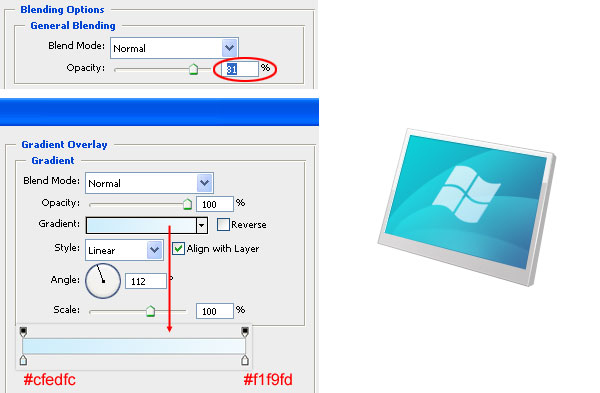
Step 15: Add a Symbol on the Screen
Let us add another touch of detail to the monitor screen. Create or import your favorite shape/logo in a new layer above the "waves" layer. I have used the Windows logo and have named its layer as "windows". You can search around Photoshop’s preset custom shapes — go to Edit > Preset Manager and then pick Custom Shapes in the Preset Type drop-down menu — to find a suitable symbol for your LCD monitor.
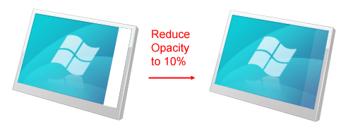
Reduce the Opacity of the symbol’s layer to around 81%, and then give it a Gradient Overlay that goes from a baby blue color (#cfedfc) to an off-white color (#f1f9fd).
Duplicate the layer and perform Edit > Transform > Flip Vertical. Use the Move Tool (V) to move the duplicate to the bottom right of the original symbol. Rotate it a little bit (about 15-20o) using Free Transform (Ctrl/Cmd + T). Adjust it again using the Move Tool (V) until it looks like a reflected version of it.
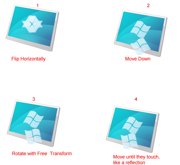
Add a layer mask to this duplicated layer and then apply a black-to-white linear gradient to the mask from the bottom to the top so that it fades away as you go further down the screen.

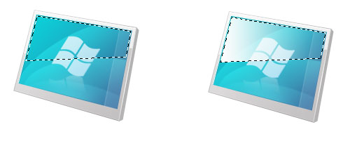
Step 16: Create a Sidebar on the Screen
In Windows Vista and 7, there are these things called widgets that you can place (by default) on the right of your desktop background. That area is denoted by a semi-transparent vertical rectangle. To add a bit more detail to our monitor, we will create that semi-transparent rectangle.
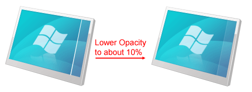
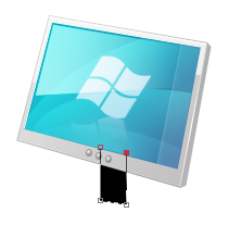
First, create a new layer (call it "sidebar") and on it, make a white shape on the right side of the screen (you can use the Pen Tool, the Rectangle Tool, or whatever tool you prefer for this). Reduce the Opacity of this white rectangle to about 10%.
We will give this sidebar a 1px border on its left (just like in Windows Vista/7). Create a new layer (you can name this layer "sidebar-stroke") and make a white line on the left of the sidebar. Then reduce the Opacity of the layer to about 10%.
Step 17: Create a Screen Gloss
We are really spending a lot of time on the screen and giving it a lot of details. This is because this area is the most prominent section of our work and also because the small details make up a big difference.
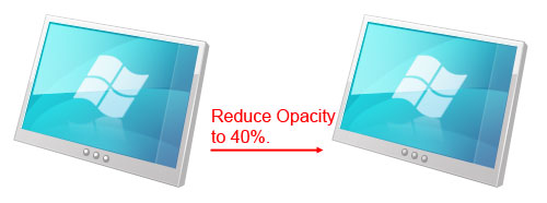
This time we’re going to give the screen a gloss at the top left. Create a new layer (call this new layer "screen-gloss"). Use the Polygonal Lasso Tool (L) to create a selection that leaves out about 1px of each side. Apply a white-to-transparent linear gradient onto the selection using the Gradient Tool (G), having the gradient go from left to right.
Set the Blend Mode to Overlay and Opacity to 60%.
Duplicate the "screen-gloss" layer and change the Blend Mode to Normal and Opacity to about 62%.

Create a new layer group (Layer > New > Group) called "screen" and drag all the layers above the "panel" layer group that’s associated with the monitor’s screen into this new group. You can collapse this group afterwards to keep our work more manageable.
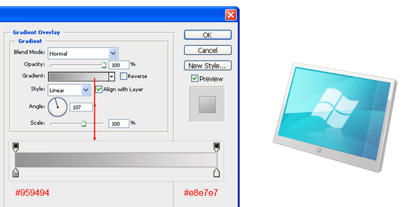
Step 18: Create the Buttons
Create a new layer over the "screen" layer group. Make a tiny black ellipse in the new layer that represents the center control of the LCD monitor.
Give this button a Stroke and Gradient Overlay.
Stroke
Position the stroke Inside and having a gray color (#9c9b9b).
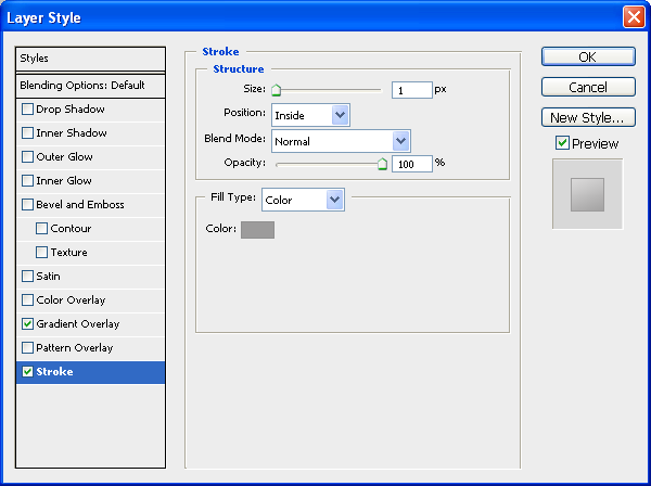
Gradient Overlay
Have the linear gradient go from a gray color (#959494) to a lighter gray color (#e8e7e7).
Duplicate this layer twice and position the two new buttons on either side of the first button using the Move Tool (V).

Merge these three layers (Ctrl/Cmd + E) and name the merged layer as "buttons".
Step 19: Give the Buttons a Gloss
Now create a new layer called "buttongloss". Make tiny white circles in this layer, just above the three buttons. Afterwards, reduce the layer Opacity of the layer to about 40%.
Create a new group (named "Buttons") and drag all the layers associated with the buttons into this group.
Step 20: Create the Stem Shape
Let us now move to the bottom portion of our LCD monitor, starting with the stem/neck of it. In the Layers Panel, click on the Background layer and then press Ctrl/Cmd + Shift + N to create a new layer just above it (you can call this new layer as "stem"). With the Pen Tool (P), make a black shape that represents the stem.
Step 21: Fade Out the Stem
Next, we will make it look like the stem is fading out as we go towards the bottom of the canvas to keep our work’s lighting consistent. Do this by applying a Gradient Overlay to its layer such that it’s darker gray (#6e6d6d) at the top and an off-white (#f3f2f2) at the bottom.

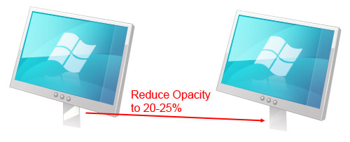
Step 22: Give the Stem a Gloss
Create a new layer (you can name this one "stem-gloss") and make a diagonal white shape over the stem using the Pen Tool (P). Afterwards, set the Opacity of this layer to around 20-25%.
Step 23: Give the Stem Its Depth
Similar to the panel, we also need to give our stem some depth and thickness. Make a new layer ("stem-thickness") and create a shape at the right side of the stem (shown in red). Give this shape a gray (#999898) Color Overlay.

Step 24: Create a Stem Shadow
We will make it look like the panel is casting a subtle shadow on the stem (again, we are minding the details). Create a new layer ("stem-shadow") and make a black shape in the area where the stem and the panel meets.
Add a layer mask to this layer by clicking on the Add layer mask icon at the bottom of the Layers Panel. Use the Gradient Tool (U) to drag a black-to-white gradient on the layer mask that goes from the top to the bottom. This should make it appear as though the shadow is fading as it goes towards the bottom of the canvas. Reduce the Opacity of the shadow’s layer to about 16%.

Create a new layer group called "stem" and move all the layers associated with the stem into it.
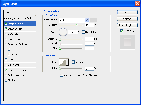
Step 25: Create the Base Shape
Next, we will create the base of the LCD monitor. Click on the Background layer and use Ctrl/Cmd + Shift + N to create a new layer above it (it should be below the stem). Draw a black ellipse.
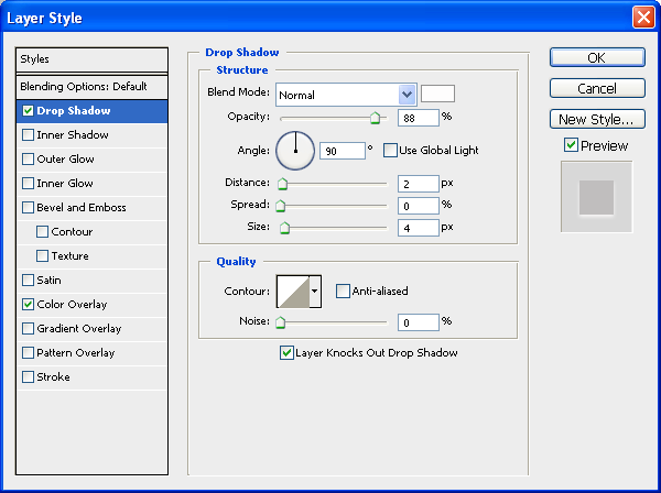
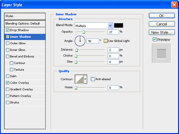
Give the base shape a Drop Shadow, an Inner Shadow, and a Gradient Overlay.
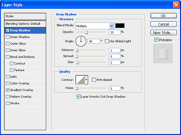
Drop Shadow
Use a light gray color (#d8d8d8) for the drop shadow’s color.
Inner Shadow
Use an off-white color (#fdfbfb) for the inner shadow’s color.

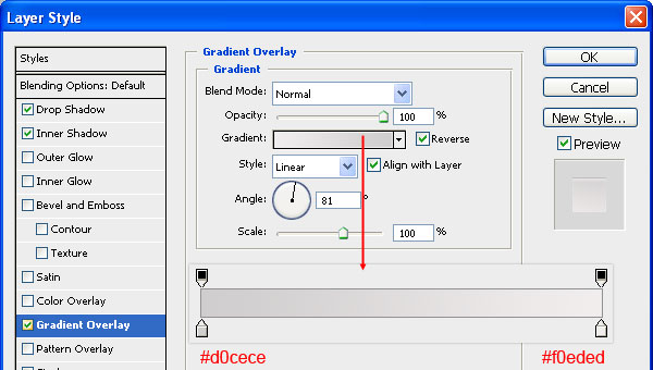
Gradient Overlay
The gradient should go from a gray color (#d0cece) to an off-white color (#f0eded).
Step 26: Give the Base a Gloss
Create a new layer and make white shapes towards the front of the base shape using the Polygonal Lasso Tool (L). Reduce the Opacity of this layer to 50%.
Step 27: Draw the Inner Groove of the Base
Create a new layer and make an elliptical shape inside the base shape (you can probably duplicate the base shape and shrink it down with Free Transform).
Give the layer a Color Overlay, a Drop Shadow and an Inner Shadow.
Color Overlay
The color should be a mid-tone gray (#c0bebe).
Drop Shadow
The drop shadow color should be white (#ffffff).
Inner Shadow
The inner shadow color should be black (#000000).
The above styles will make it look like:
Step 28: Give the Base Some Depth
Duplicate the base shape again. Make sure that the duplicate is placed below the original. Move it down a bit.
Give the layer a Drop Shadow and a Gradient Overlay.
Drop Shadow
The drop shadow color should be black (#000000).
Gradient Overlay
The gradient will have 4 stops. From left to right, they are #aeaeae, #dbd8d8, #e5e2e2 and #d3cece.

You will now have something like this:

Step 29: Create a Shine on the Base
In a new layer (name it "base-shine" and place it just above the "base-engrave" layer), make a thin white shape using the Polygonal Lasso Tool (L).

Step 30: Cast a Shadow Behind the Panel
To keep our lighting consistent, we need a shadow behind the panel. Create a new layer for the shadow just above the background. Select a rectangular area (you can use the Polygonal Lasso Tool) that matches the orientation of the panel. Apply a black-to-transparent gradient using the Gradient Tool (G) inside the selected area. Once done, use Filter > Blur > Gaussian Blur with a Radius between 1-1.5px to soften the edges of the shadow’s shape. Afterwards, just reduce the layer’s Opacity to around 15%.

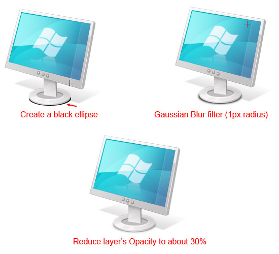
Step 31: Cast a Shadow Below the Base
Next, we will work on the base’s shadow. Create a new layer for it and make a black ellipse with the Elliptical Marquee Tool, just below the base. Again, just like the shadow behind the panel, choose Filter > Blur > Gaussian Blur with a Radius of about 1px. Reduce the layer’s Opacity to about 30%.
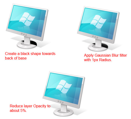
Create a layer just above the "base-shine" layer that we created earlier. Make a black shape that covers part of the back of the base of our LCD monitor. Afterwards, use the Gaussian Blur filter with the Radius at 1.3px to soften the edges. Once the filter has been applied, lower the Opacity of the layer to about 5%.
Step 32: Light Reflection at the Bottom of the Stem
Create a new layer just above the "stem-shadow" layer that we created earlier. On this new layer, use the Polygonal Lasso Tool to draw a shape for the light reflection, positioned at the bottom of the stem. Reduce the layer’s Opacity to about 20% afterwards.
Step 33: Improve the Lighting Around the Buttons
Still the lighting looks a little inconsistent. Ah, the buttons are located over a pale background. Open up the "panel" layer group, create a new layer on top of the "’bottom-edge-shine" layer, and on it, make a thin white line that goes across the screen.
Make a new layer again. Create a white half-ellipse with the Elliptical Marquee Tool that is located just behind our three buttons. Use Filter > Blur > Gaussian Blur with a Radius set around 4-5px to soften up the lighting; this is the final thing you have to do.
Tutorial Summary
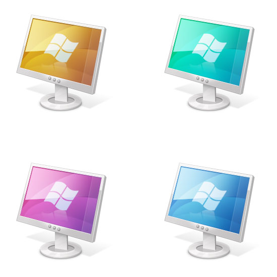
A wonderful thing about what we have created is that we can change the layer styles to get different colors for the screen. For example, here are some that I created just by modifying our "screen-main" layer’s layer style. I hope you learned plenty of techniques with respect to drawing icons from scratch using Photoshop. Leave your thoughts and questions in the comments.s
http://designinstruct.com
Download Source Files


